From Dates to Insights – Building an Interactive Calendar in Power BI

Advertisements

A calendar is more than a way to track dates—it’s a powerful tool for analyzing patterns over time. In Power BI, building a dynamic calendar visual allows you to explore performance across days, weeks, months, and years in an interactive and visually appealing way.

In this guide, we’ll walk step by step through creating a professional dynamic calendar visualization in Power BI, supported with examples and DAX code.

Most reports rely heavily on the time dimension, but traditional charts often fail to highlight day-by-day patterns. A calendar visual helps you:

  • Spot distributions: Identify the busiest and slowest days at a glance.
  • Enable easy comparisons: Compare performance across weeks or months.
  • Deliver visual impact: Present data in a format users instantly understand.

example: An e-commerce store uses a dynamic calendar to see which days drive the most orders, helping the marketing team plan promotions strategically.
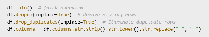
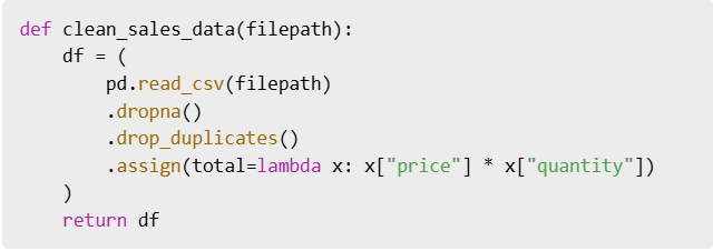
Before building the visual, you need a proper Date Table. You can generate one in Power BI using DAX:

Tip: Don’t forget to mark it as a Date Table in Power BI.

Advertisements

Now let’s transform this into a calendar view using the Matrix visual:

  1. Add a Matrix visual.
  2. Place Month and Year on the rows.
  3. Place Weekday on the columns.
  4. Use Day or a measure (like total sales) in the values field.

The Matrix will now display your data in a grid resembling a calendar.

To turn the static calendar into an interactive tool:

  • Conditional formatting: Color cells based on values (e.g., green = high sales, red = low).
  • Slicers: Allow users to filter by year, month, or product.
  • Tooltips: Show detailed insights when hovering over a specific day.

Real-world example: A service company uses tooltips to display daily customer visits and revenue when hovering over a date.

Measures make your calendar more insightful. For example, to calculate sales:

Or count daily orders:

You can then display these measures inside the calendar, making each cell a mini insight point.

To polish your calendar visualization:

  • Use Custom Visuals like Calendar by MAQ Software from AppSource.
  • Apply Themes that align with your company branding.
  • Add Year-over-Year comparisons for more advanced analytics.

Building a dynamic calendar visual in Power BI is not just about aesthetics—it’s about making time-based insights accessible and actionable. With a Date Table, a Matrix visual, and some interactivity, you can transform raw numbers into a calendar that tells a story.

Next time you design a Power BI report, try including a calendar visual—you’ll be surprised how much clarity it brings to your data.

Advertisements

Power BI من التواريخ إلى الرؤى – إنشاء تقويم تفاعلي في

Advertisements

التقويم ليس مجرد وسيلة لتتبع التواريخ، بل هو أداة فعّالة لتحليل الأنماط بمرور الوقت

: يتيح لك إنشاء عرض مرئي ديناميكي للتقويم Power BI ففي

استكشاف الأداء على مدار الأيام والأسابيع والأشهر والسنوات بطريقة تفاعلية وجذابة بصرياً

في هذا الدليل سنشرح خطوة بخطوة كيفية إنشاء عرض احترافي

DAX مدعوماً بأمثلة وأكواد Power BI للتقويم الديناميكي في

تعتمد معظم التقارير بشكل كبير على بُعد الوقت ولكن المخططات التقليدية غالباً ما تفشل في إبراز الأنماط اليومية، يساعدك عرض التقويم المرئي على

تحديد التوزيعات: تحديد الأيام الأكثر ازدحاماً والأبطأ في لمحة

تسهيل المقارنات: مقارنة الأداء على مدار الأسابيع أو الأشهر

تقديم تأثير بصري: عرض البيانات بتنسيق يفهمه المستخدمون فوراً

مثال: يستخدم متجر للتجارة الإلكترونية تقويماً ديناميكياً لمعرفة الأيام التي تشهد أكبر عدد من الطلبات مما يساعد فريق التسويق على التخطيط الاستراتيجي للحملات الترويجية

قبل إنشاء المخطط ستحتاج إلى جدول تواريخ مناسب

DAX باستخدام Power BI فيمكنك إنشاء واحد في

Power BI نصيحة: لا تنسى تحديده كجدول تواريخ في

Advertisements

Matrix Visual لنحوّل الآن هذا إلى عرض تقويم باستخدام

Matrix Visual أضف

ضع الشهر والسنة في الصفوف

ضع يوم الأسبوع في الأعمدة

استخدم اليوم أو مقياساً (مثل إجمالي المبيعات) في حقل القيم

الآن بياناتك في شبكة تشبه التقويم Matrix ستعرض

مثال: تخطيط تقويم يعرض عدد الطلبات اليومية في عرض شهري

لتحويل التقويم الثابت إلى أداة تفاعلية

التنسيق الشرطي: لوّن الخلايا بناءً على القيم (مثلاً: الأخضر = أعلى مبيعات، الأحمر = أقل مبيعات)

المُقسّمات: تسمح للمستخدمين بالتصفية حسب السنة أو الشهر أو المنتج

تلميحات الأدوات: عرض رؤى تفصيلية عند تمرير مؤشر الماوس فوق يوم محدد

مثال: تستخدم شركة خدمات تلميحات لعرض زيارات العملاء اليومية والإيرادات عند تمرير مؤشر الماوس فوق تاريخ معين

:تجعل المقاييس تقويمك أكثر دقة، فعلى سبيل المثال، لحساب المبيعات

: أو لحساب الطلبات اليومية

يمكنك بعد ذلك عرض هذه المقاييس داخل التقويم مما يجعل كل خلية بمثابة نقطة إدراك صغيرة

لتحسين عرض تقويمك: استخدم عناصر مرئية مخصصة

AppSource من MAQ Software من Calendar مثل

طبّق سمات تتوافق مع هوية شركتك

أضف مقارنات سنوية لتحليلات أكثر تقدماً

Power BI لا يقتصر إنشاء عرض تقويم ديناميكي في

على الجانب الجمالي فحسب بل يهدف أيضاً إلى جعل الرؤى الزمنية في متناول الجميع وقابلة للتنفيذ، فباستخدام جدول بيانات وعرض مصفوفة وبعض التفاعل يمكنك تحويل الأرقام الخام إلى تقويم يروي قصة

Power BI في المرة القادمة التي تصمم فيها تقرير

جرّب تضمين عرض تقويم – ستندهش من مدى الوضوح الذي يُضفيه على بياناتك

Advertisements

How I Designed My Best KPI Card in Power BI

Advertisements

In the world of data visualization, small details often make the biggest difference. One of the most powerful yet simple visuals in Power BI is the KPI card. It may look minimal, but when designed correctly, it can turn raw numbers into quick, actionable insights. In this article, I’ll walk you through how I created my best Power BI KPI card, the thought process behind it, and why it made such a strong impact on reporting and decision-making.

A KPI card in Power BI is a visual element that highlights one key number—such as revenue, profit margin, or customer retention rate. It provides quick snapshots of performance without overwhelming users with too much detail.

Example: Instead of showing a whole sales report, a KPI card might just show “Monthly Sales: $120,000”, making it clear and easy to digest.

When I started using Power BI, my KPI cards were plain—just numbers in a box. While functional, they didn’t tell a story or give enough context. I realized that a great KPI card should not only show a value but also:

  • Indicate progress toward a goal
  • Highlight changes over time
  • Use colors and icons to guide attention

For example, a sales KPI card showing $120,000 (up 15%) in green is much more insightful than just showing $120,000.

1. Choosing the Right Metric

I picked Net Profit Margin as the main KPI because it reflects both sales and costs, offering a balanced view of performance.

2. Adding Context with Targets

I set a target margin of 20%. Instead of just showing the current margin, the KPI card displayed:

  • Current Margin: 18%
  • Target: 20%
  • Status: Slightly below target
Advertisements

3. Using Conditional Formatting

I applied colors to quickly signal performance:

  • Green if margin ≥ 20%
  • Yellow if between 15–19%
  • Red if < 15%

This way, managers could immediately see performance without reading details.

4. Enhancing with Trend Indicators

I included an up/down arrow to show whether the margin improved compared to last month. A simple arrow added huge clarity.

This KPI card stood out because it wasn’t just a number—it was a decision-making tool. Executives could glance at it and instantly know:

  • Current performance
  • How close we were to the goal
  • Whether we were improving or declining

It turned reporting into actionable insights, and that’s the ultimate goal of Power BI.

Imagine a retail company using this KPI card.

  • January Margin: 18% (red arrow down)
  • February Margin: 21% (green arrow up)

Within seconds, leadership knows that February outperformed expectations and that corrective actions taken in January worked.

A well-designed KPI card in Power BI is more than a simple number. It’s a visual story that provides clarity, direction, and impact. My best KPI card combined clear metrics, contextual targets, color coding, and trend indicators—transforming data into meaningful insights.

If you haven’t experimented with KPI cards yet, start small but design with purpose. A single card can be more powerful than a whole dashboard if done right.

Advertisements

Power BI في KPI كيف صممت أفضل بطاقة

Advertisements

في عالم تصور البيانات غالباً ما تُحدث التفاصيل الصغيرة فرقاً كبيراً

KPI إذ تُعد بطاقة مؤشرات الأداء الرئيسية

Power BI من أقوى العناصر المرئية وأكثرها بساطةً في

وهي قد تبدو بسيطة ولكن عند تصميمها بشكل صحيح يُمكنها تحويل الأرقام الخام إلى رؤى سريعة وقابلة للتنفيذ، وفي هذه المقالة سأشرح لكم

Power BI في  KPI كيف صممتُ أفضل بطاقة  

والعملية الفكرية وراءها ولماذا كان لها هذا التأثير القوي على إعداد التقارير واتخاذ القرارات

Power BI في KPI بطاقة

هي عنصر مرئي يُبرز رقماً رئيسياً واحداً مثل الإيرادات أو هامش الربح أو معدل الاحتفاظ بالعملاء، فتُوفر البطاقة لمحات سريعة عن الأداء دون إثقال كاهل المستخدمين بتفاصيل كثيرة

مثال: بدلاً من عرض تقرير مبيعات كامل قد تعرض بطاقة مؤشرات الأداء الرئيسية ” المبيعات الشهرية : 120,000 دولار أمريكي” مما يجعلها واضحة وسهلة الفهم

KPI كانت بطاقات Power BI عندما بدأتُ باستخدام  

الخاصة بي بسيطة مجرد أرقام في مربع، وعلى الرغم من فعاليتها إلا أنها لم تسرد قصة أو تُقدم سياقاً كافياً، حينها أدركتُ أن بطاقة مؤشرات الأداء الرئيسية الفعّالة لا ينبغي أن تُظهر قيمةً فحسب بل ينبغي أيضاً أن تتضمن

•  الإشارة إلى التقدم نحو هدف

•  إبراز التغييرات بمرور الوقت

•  استخدام الألوان والأيقونات لتوجيه الانتباه

على سبيل المثال: بطاقة مؤشرات أداء رئيسية للمبيعات تُظهر 120,000 دولار أمريكي (بزيادة 15%) باللون الأخضر تُعدّ أكثر ثراءً من مجرد إظهار 120,000 دولار أمريكي

Advertisements

1. اختيار المقياس المناسب

اخترتُ هامش صافي الربح كمؤشر أداء رئيسي لأنه يعكس كلاً من المبيعات والتكاليف مما يُقدم رؤية متوازنة للأداء

2. إضافة سياق للأهداف

حددتُ هامش ربح مستهدفاً بنسبة 20% بدلاً من مجرد عرض الهامش الحالي، وعليه عرضت بطاقة مؤشر الأداء الرئيسي ما يلي

18% : الهامش الحالي

20% : الهدف

الحالة: أقل بقليل من الهدف

٣. استخدام التنسيق الشرطي

استخدمتُ ألواناً للإشارة بسرعة إلى الأداء

• ٪أخضر إذا كان الهامش ≥ ٢٠

• ٪ أصفر إذا كان بين ١٥٪ و١٩

• أحمر إذا كان أقل من ٪١٥

بهذه الطريقة تمكن المدراء من رؤية الأداء فوراً دون الحاجة إلى قراءة التفاصيل

٤. التحسين باستخدام مؤشرات الاتجاه

أضفتُ سهماً لأعلى/لأسفل لإظهار ما إذا كان الهامش قد تحسن مقارنةً بالشهر الماضي، بحيث أضاف سهم بسيط وضوحاً كبيراً  

برزت بطاقة مؤشر الأداء الرئيسي هذه لأنها لم تكن مجرد رقم بل كانت أداة لاتخاذ القرارات، فيمكن للمديرين التنفيذيين إلقاء نظرة سريعة عليها ومعرفة ما يلي

•  الأداء الحالي

•  مدى قربنا من الهدف

•  ما إذا كنا نتحسن أم نتراجع

لقد حوّلت التقارير إلى رؤى عملية

Power BI وهذا هو الهدف الرئيسي لدى

: مثال

تخيل شركة تجزئة تستخدم بطاقة مؤشرات الأداء الرئيسية هذه

• هامش يناير: ١٨٪ (سهم أحمر للأسفل)

• هامش فبراير: ٢١٪ (سهم أخضر للأعلى)

في غضون ثوانٍ تُدرك القيادة أن أداء فبراير فاق التوقعات وأن الإجراءات التصحيحية المتخذة في يناير نجحت

Power BI بطاقة مؤشرات الأداء الرئيسية المُصممة جيداً في

هي أكثر من مجرد رقم بسيط، إنها قصة بصرية تُقدم الوضوح والتوجيه والتأثير، أفضل بطاقة مؤشرات أداء رئيسية لديّ جمعت بين مقاييس واضحة وأهداف سياقية وترميز ألوان ومؤشرات اتجاهات مما يُحوّل البيانات إلى رؤى قيّمة

إذا لم تُجرّب بطاقات مؤشرات الأداء الرئيسية بعد فابدأ بمشاريع صغيرة ولكن صمّمها بهدف، فبطاقة واحدة يُمكن أن تكون أقوى من لوحة معلومات كاملة إذا تم تنفيذها بشكل صحيح

Advertisements

Mastering the Math for Machine Learning / A Step-by-Step Guide

Advertisements

When people hear “machine learning,” they often imagine advanced algorithms, massive datasets, and futuristic applications. But at the heart of all of this lies a very old discipline: mathematics.

It is the language that powers every neural network, regression model, and recommendation system. Many learners feel intimidated because they think they need to master every single branch of math. The truth is, you don’t — you only need to focus on the specific areas that drive machine learning forward.

This article will guide you step by step through the math you need, why it matters, and how to actually learn it without getting lost.

Linear algebra forms the foundation of machine learning. Data in machine learning is often represented as vectors and matrices. For example, a grayscale image can be thought of as a matrix where each element corresponds to the brightness of a pixel. When you feed that image into a machine learning model, it performs matrix operations to detect patterns such as edges, shapes, and textures.

To get comfortable, focus on the basics: vectors, matrices, matrix multiplication, dot products, and eigenvalues. Once you understand these, you’ll see why every deep learning library (like TensorFlow or PyTorch) is essentially a giant machine for matrix operations.

Real-life example: When Netflix recommends movies, it uses linear algebra to represent both users and movies in a shared space. By comparing the “distance” between your vector and a movie’s vector, the system decides whether to recommend it.

While linear algebra structures the data, calculus drives the learning process. Machine learning models improve themselves by minimizing error — and that is achieved through derivatives and gradients.

For instance, the popular Gradient Descent algorithm is simply an application of calculus. By taking the derivative of the loss function with respect to model parameters, the algorithm knows which direction to move to reduce errors. You don’t need to master every integration trick, but you should feel comfortable with derivatives, partial derivatives, and gradients.

Real-life example: Imagine training a self-driving car’s vision system. The model makes a mistake identifying a stop sign. Gradient Descent kicks in, adjusting the model’s internal parameters (weights) slightly so that next time, the probability of recognizing the stop sign is higher. That entire process is powered by calculus.

Machine learning is about making predictions under uncertainty, and that’s exactly where probability and statistics come in. Without them, you can’t evaluate models, understand error rates, or deal with randomness in data.

Key concepts include probability distributions, expectation, variance, conditional probability, and hypothesis testing. These tools help you answer questions like: How confident is the model in its prediction? Is this result meaningful, or just random noise?

Real-life example: In spam detection, a model doesn’t “know” for sure if an email is spam. Instead, it assigns a probability, such as 95% spam vs. 5% not spam. That probability comes from statistical modeling and probability theory.

Advertisements

Every machine learning model has one ultimate goal: optimization. Whether it’s minimizing the error in predictions or maximizing the accuracy of classification, optimization ensures the model keeps getting better.

Basic optimization concepts include cost functions, convexity, constraints, and gradient-based optimization methods. Even complex deep learning boils down to solving optimization problems efficiently.

Real-life example: Support Vector Machines (SVMs), one of the classic ML algorithms, rely entirely on optimization to find the best decision boundary between two classes. Without optimization, the algorithm wouldn’t know which boundary is the “best.”

Though sometimes overlooked, discrete mathematics provides the foundation for algorithms and data structures — both critical in machine learning. Concepts like sets, combinatorics, and graph theory help us design efficient models and handle structured data.

Real-life example: Decision trees, widely used in machine learning, depend heavily on concepts from discrete math. They split data based on logical conditions and count possible outcomes — exactly the kind of reasoning that discrete math teaches.

  • Start small, but stay consistent. Pick one math topic and dedicate short daily sessions to it.
  • Apply while you learn. Don’t study math in isolation. Code small ML models in Python to see concepts like gradients or matrices in action.
  • Use visual resources. Channels like 3Blue1Brown make abstract concepts like eigenvectors and gradient descent easy to grasp visually.
  • Practice problems. Work through exercises, not just theory. Solving problems cements your understanding.

You don’t need to be a mathematician to succeed in machine learning, but you do need the right mathematical foundations. Focus on linear algebra for data representation, calculus for learning dynamics, probability and statistics for handling uncertainty, optimization for model improvement, and discrete math for algorithmic thinking. When you learn these topics gradually and connect them to coding practice, math stops being an obstacle and becomes your greatest ally in building powerful machine learning models.

Advertisements

إتقان الرياضيات للتعلم الآلي

دليل خطوة بخطوة

Advertisements

عندما يسمع الناس عن “التعلم الآلي” غالباً ما يتخيلون خوارزميات متقدمة ومجموعات بيانات ضخمة وتطبيقات مستقبلية، لكن في جوهر كل هذا يمكن تلخيص الموضوع باختصاص شامل : الرياضيات

إنها اللغة التي تُشغّل كل شبكة عصبية ونموذج انحدار ونظام توصية، إذ يشعر العديد من المتعلمين بالرهبة لأنهم يعتقدون أنهم بحاجة إلى إتقان كل فرع من فروع الرياضيات لكن الحقيقة ليست كذلك، فما عليك سوى التركيز على المجالات المحددة التي تُمكّن التعلم الآلي من التقدم

سترشدك هذه المقالة خطوة بخطوة خلال الرياضيات التي تحتاجها وأهميتها وكيفية تعلمها فعلياً دون أن تضيع

يُشكّل الجبر الخطي أساس التعلم الآلي، فغالباً ما تُمثّل البيانات في التعلم الآلي كمتجهات ومصفوفات، فعلى سبيل المثال يمكن اعتبار صورة تدرج الرمادي مصفوفة حيث يُقابل كل عنصر سطوع بكسل، وعند إدخال تلك الصورة في نموذج تعلّم آلي يُجري عمليات مصفوفة لاكتشاف أنماط مثل الحواف والأشكال والقوام للتعود على الأساسيات ركّز على المتجهات والمصفوفات وضرب المصفوفات وحاصل الضرب النقطي والقيم الذاتية، فبمجرد فهمك لهذه الأساسيات ستدرك لماذا تُعدّ كل مكتبة تعلّم عميق

PyTorch أو TensorFlow :مثل

في جوهرها آلة عملاقة لعمليات المصفوفات

: وعلى سبيل المثال

بأفلام Netflix عندما تُوصي

فإنها تستخدم الجبر الخطي لتمثيل كلٍّ من المستخدمين والأفلام في مساحة مشتركة بمقارنة “المسافة” بين متجهك ومتجه الفيلم يُقرر النظام ما إذا كان سيُوصي به أم لا

بينما يُنظّم الجبر الخطي البيانات يُحرّك التفاضل والتكامل عملية التعلم، إذ تُحسّن نماذج تعلّم الآلة نفسها من خلال تقليل الأخطاء ويتحقق ذلك من خلال المشتقات والتدرجات

على سبيل المثال: خوارزمية الانحدار التدرجي الشائعة هي ببساطة تطبيق للتفاضل والتكامل، فبأخذ مشتقة دالة الخسارة بالنسبة لمعلمات النموذج تعرف الخوارزمية الاتجاه الذي يجب أن تتحرك فيه لتقليل الأخطاء، إذاً لستَ بحاجة إلى إتقان جميع حيل التكامل ولكن يجب أن تكون مُلِماً بالمشتقات والمشتقات الجزئية والتدرجات

ومثالنا على ذلك: تخيّل تدريب نظام رؤية لسيارة ذاتية القيادة يرتكب النموذج خطأً في تحديد إشارة توقف، يبدأ الانحدار التدريجي مع تعديل المعلمات الداخلية للنموذج (الأوزان) قليلاً بحيث يكون احتمال التعرف على إشارة التوقف في المرة القادمة أعلى، تعتمد هذه العملية برمتها على حساب التفاضل والتكامل

يتعلق التعلم الآلي بالتنبؤات في ظل التفاوت بين الشك واليقين، وهنا تحديداً يأتي دور الاحتمالات والإحصاء، فبدونهما لا يمكنك تقييم النماذج أو فهم معدلات الخطأ أو التعامل مع العشوائية في البيانات

تشمل المفاهيم الرئيسية توزيعات الاحتمالات والتوقع والتباين والاحتمال الشرطي واختبار الفرضيات، إذ تساعدك هذه الأدوات في الإجابة على أسئلة مثل: ما مدى ثقة النموذج في تنبؤاته؟ هل هذه النتيجة ذات معنى أم أنها مجرد ضوضاء عشوائية؟

مثال: في عملية اكتشاف البريد العشوائي لا “يتأكد” النموذج من كون البريد الإلكتروني بريداً عشوائياً، فبدلاً من ذلك يُحدد احتمالاً مثل 95% بريد عشوائي مقابل 5% ليس بريداً عشوائياً ، يأتي هذا الاحتمال من النمذجة الإحصائية ونظرية الاحتمالات

Advertisements

لكل نموذج تعلم آلي هدف نهائي واحد: التحسين، فسواء كان ذلك تقليل الخطأ في التنبؤات أو زيادة دقة التصنيف إلى أقصى حد فإن التحسين يضمن استمرار تحسن النموذج

تشمل مفاهيم التحسين الأساسية دوال التكلفة والتحدب والقيود وطرق التحسين القائمة على التدرج، حتى التعلم العميق المعقد يتلخص في حل مشاكل التحسين بكفاءة فعلي سبيل المثال

SVMs إن آلات دعم المتجهات

وهي إحدى خوارزميات التعلم الآلي الكلاسيكية تعتمد كلياً على التحسين لإيجاد أفضل حدود القرار بين فئتين، فبدون التحسين لن تعرف الخوارزمية أي الحدود “الأفضل”

على الرغم من إغفالها أحياناً تُوفر الرياضيات المنفصلة الأساس للخوارزميات وهياكل البيانات وكلاهما أساسي في التعلم الآلي، بحيث تساعدنا مفاهيم مثل المجموعات والتوافقيات ونظرية الرسوم البيانية في تصميم نماذج فعّالة ومعالجة البيانات المُهيكلة

مثال من الحياة الواقعية: تعتمد أشجار القرار المُستخدمة على نطاق واسع في التعلم الآلي بشكل كبير على مفاهيم من الرياضيات المنفصلة، فهي تُقسّم البيانات بناءً على الشروط المنطقية وتُحصي النتائج المُحتملة وهو بالضبط نوع التفكير الذي تُعلّمه الرياضيات المنفصلة

ابدأ بخطوات صغيرة ولكن حافظ على الاتساق، اختر موضوعاً رياضياً واحداً وخصص له جلسات يومية قصيرة *

طبّق ما تعلمته أثناء الدرس ولا تدرس الرياضيات بمعزل عن غيرها، ثم برمج نماذج تعلم آلي صغيرة باستخدام بايثون لرؤية مفاهيم مثل التدرجات أو المصفوفات عملياً

استخدم الموارد البصرية *

تجعل المفاهيم المجردة Blue1Brown3 قنوات مثل

مثل المتجهات الذاتية وانحدار التدرج سهلة الفهم بصرياً

تدرب على حل المسائل، حلّ التمارين وليس فقط النظريات، فحل المسائل يعزز فهمك *

لست بحاجة إلى أن تكون عالم رياضيات لتنجح في التعلم الآلي ولكنك تحتاج إلى الأسس الرياضية الصحيحة، ركّز على الجبر الخطي لتمثيل البيانات وحساب التفاضل والتكامل لتعلم الديناميكيات والاحتمالات والإحصاء لمعالجة عدم اليقين والتحسين لتحسين النماذج والرياضيات المنفصلة للتفكير الخوارزمي، فعندما تتعلم هذه المواضيع تدريجياً وتربطها بممارسة البرمجة تتوقف الرياضيات عن كونها عائقاً وتصبح حليفك الأكبر في بناء نماذج تعلم آلي فعّالة

Advertisements

AI Certificates That Guarantee High Salaries This Year

Advertisements

In 2025, Artificial Intelligence is no longer just a buzzword—it’s a goldmine for career growth. Companies across tech, finance, healthcare, and even creative industries are willing to pay $120K to $200K+ for professionals with the right AI skills. But here’s the truth: having just AI knowledge isn’t enough. Employers want proof you can apply it—and that’s where top-tier AI certifications come in.

These credentials not only validate your expertise but also give you a competitive edge in a job market that’s moving faster than ever. In this article, we’ll break down the best AI certifications to land you a high-paying role in 2025, plus real-world salary examples to show their impact.

Why It’s Worth It:
Offered by Google Cloud, this certification focuses on designing, building, and deploying ML models at scale. It’s highly respected because it tests your real-world problem-solving skills, not just theory.

Average Salary: $150K–$180K+
Key Skills Covered:

  • ML pipeline design and optimization
  • Google Cloud AI tools (Vertex AI, BigQuery ML)
  • Model deployment and monitoring

Example: A certified ML engineer at a fintech startup earned a $40K raise within six months after getting this credential.

Why It’s Worth It:
Microsoft’s Azure platform powers thousands of AI-driven applications worldwide. This certification ensures you can design AI solutions using Azure Cognitive Services, Language Understanding (LUIS), and Computer Vision.

Average Salary: $140K–$165K+
Key Skills Covered:

  • Building chatbots and NLP models
  • Deploying AI solutions in the cloud
  • Integrating AI with enterprise apps

Example: A mid-level developer transitioned into an AI engineer role with a $30K salary jump after earning this cert.

Advertisements

Why It’s Worth It:
A beginner-to-intermediate track that’s perfect if you want hands-on exposure to AI and ML using Python, Scikit-learn, and TensorFlow. Recognized globally due to IBM’s brand reputation.

Average Salary: $120K–$150K+
Key Skills Covered:

  • Machine learning fundamentals
  • Deep learning with Keras and PyTorch
  • AI application deployment

Example: A data analyst used this cert to switch to AI project management, boosting income by 45%.

Why It’s Worth It:
Amazon Web Services dominates the cloud market, and this certification proves you can build and deploy ML models using AWS SageMaker, Rekognition, and Comprehend.

Average Salary: $155K–$200K+
Key Skills Covered:

  • Data engineering for ML
  • Model training and tuning
  • AI-driven automation

Example: A senior developer became a cloud AI consultant post-certification and now bills $150/hour.

Why It’s Worth It:
Taught by Andrew Ng, this program is a global benchmark for AI education. While not a “vendor” certification, it opens doors to research and product innovation roles.

Average Salary: $140K–$175K+
Key Skills Covered:

  • Core ML algorithms
  • Neural networks
  • Real-world AI deployment strategies

Example: A startup co-founder used this credential to attract investors by showcasing technical credibility.

  • Match with your career goal: Cloud AI certs (AWS, Azure, Google) are great for deployment-heavy roles, while academic certs (Stanford, IBM) suit research or product innovation paths.
  • Check employer demand: Use LinkedIn or Indeed to see which certifications appear most in job postings.
  • Leverage your background: If you already know Python and data analysis, go for intermediate/advanced tracks; beginners should start with foundational certs.

AI is not just the future—it’s the present. With the right certification, you can break into a high-paying career, shift to a more in-demand role, or even launch your own AI-powered startup. The key is choosing a certification that aligns with your skills and ambitions, then applying it to solve real-world problems.

Your next step? Pick one of the certifications above, commit to the training, and let 2025 be the year your career skyrockets.

CertificationProviderCost (Approx.)DurationKey SkillsAvg. Salary After Completion
Google Professional Machine Learning EngineerGoogle Cloud$200 USD (exam fee)3–6 months prepML pipeline design, Google Cloud AI tools, deployment$150K–$180K+
Microsoft Certified: Azure AI Engineer AssociateMicrosoft$165 USD (exam fee)2–4 months prepAzure Cognitive Services, NLP, Computer Vision$140K–$165K+
IBM AI Engineering Professional CertificateIBM (via Coursera)$39/month subscription4–6 monthsPython, Deep Learning, Scikit-learn, PyTorch$120K–$150K+
AWS Certified Machine Learning – SpecialtyAmazon Web Services$300 USD (exam fee)4–7 months prepAWS SageMaker, AI-driven automation, model tuning$155K–$200K+
Machine Learning SpecializationStanford University (Andrew Ng)$79/month (Coursera)3–5 monthsCore ML algorithms, neural networks, real-world AI$140K–$175K+
Advertisements

شهادات الذكاء الاصطناعي التي تضمن رواتب عالية هذا العام

Advertisements

في عام ٢٠٢٥ لم يعد الذكاء الاصطناعي مجرد مصطلح شائع بل أصبح منجماً ذهبياً للنمو المهني، فالشركات في قطاعات التكنولوجيا والمالية والرعاية الصحية وحتى الصناعات الإبداعية مستعدة لدفع مبالغ تتراوح بين ١٢٠ ألف دولار و٢٠٠ ألف دولار أمريكي للمتخصصين ذوي المهارات المناسبة في مجال الذكاء الاصطناعي، ولكن الحقيقة هي أن امتلاك المعرفة بالذكاء الاصطناعي وحده لا يكفي، فأصحاب العمل يريدون إثباتاً على قدرتهم على تطبيق هذه المعرفة وهنا يأتي دور شهادات الذكاء الاصطناعي المرموقة

لا تُثبت هذه الشهادات خبرتك فحسب بل تمنحك أيضاً ميزة تنافسية في سوق عمل يشهد تطوراً متسارعاً  

في هذا المقال سنستعرض أفضل شهادات الذكاء الاصطناعي التي تضمن لك وظيفة براتب مرتفع في عام ٢٠٢٥ قد يصل إلى مئات الآلاف من الدولارات بالإضافة إلى أمثلة واقعية على الرواتب لتوضيح تأثيرها

لماذا تستحق هذه الشهادة العناء ؟

تُقدم هذه الشهادة من جوجل كلاود وتُركز على تصميم وبناء ونشر نماذج تعلم الآلة على نطاق واسع  إذ تحظى هذه الشهادة باحترام كبير لأنها تختبر مهاراتك في حل المشكلات العملية وليس النظرية فقط

متوسط الراتب: ١٥٠ ألف دولار أمريكي – ١٨٠ ألف دولار أمريكي فأكثر

: المهارات الرئيسية المشمولة

تصميم وتحسين خط أنابيب التعلم الآلي *

Google Cloud أدوات الذكاء الاصطناعي من *

نشر النماذج ومراقبتها *

مثال: حصل مهندس تعلم آلي معتمد في شركة ناشئة في مجال التكنولوجيا المالية على زيادة قدرها ٤٠ ألف دولار أمريكي خلال ستة أشهر من حصوله على هذه الشهادة

ما أهمية هذه الشهادة ؟

آلاف التطبيقات Microsoft من Azure تدعم منصة

التي تعتمد على الذكاء الاصطناعي حول العالم، بحيث تضمن لك هذه الشهادة القدرة على تصميم حلول الذكاء الاصطناعي

المعرفية Azure باستخدام خدمات

والرؤية الحاسوبية LUIS وفهم اللغة

متوسط الراتب: ١٤٠ ألف دولار أمريكي – ١٦٥ ألف دولار أمريكي فأكثر

:المهارات الرئيسية المشمولة

بناء روبوتات الدردشة ونماذج معالجة اللغة الطبيعية *

نشر حلول الذكاء الاصطناعي في السحابة *

دمج الذكاء الاصطناعي مع تطبيقات المؤسسات *

مثال: انتقل مطور متوسط المستوى إلى وظيفة مهندس ذكاء اصطناعي وراتبه ارتفع بمقدار ٣٠ ألف دولار أمريكي بعد حصوله على هذه الشهادة

Advertisements

لماذا تستحق الدراسة ؟ مسار من المستوى المبتدئ إلى المتوسط، مثالي إذا كنت ترغب في اكتساب خبرة عملية في الذكاء الاصطناعي والتعلم الآلي

TensorFlow و Scikit-learn باستخدام بايثون و

التجارية IBM معترف به عالمياً بفضل سمعة

متوسط الراتب: ١٢٠ ألف دولار أمريكي – ١٥٠ ألف دولار أمريكي فأكثر

:المهارات الرئيسية المشمولة

أساسيات تعلم الآلة *

PyTorch و Keras التعلم العميق باستخدام *

نشر تطبيقات الذكاء الاصطناعي *

مثال: استخدم محلل بيانات هذه الشهادة للانتقال إلى إدارة مشاريع الذكاء الاصطناعي، مما زاد دخله بنسبة %٤٥

لماذا تستحق العناء؟

على سوق الحوسبة السحابية Amazon Web Services تهيمن

وتثبت هذه الشهادة قدرتك على بناء ونشر نماذج تعلم الآلة

   Comprehend و Rekognition و AWS SageMaker باستخدام

متوسط الراتب: ١٥٥ ألف دولار أمريكي – ٢٠٠ ألف دولار أمريكي فأكثر

:المهارات الرئيسية المشمولة

هندسة البيانات لتعلم الآلة *

تدريب النماذج وضبطها *

الأتمتة المعتمدة على الذكاء الاصطناعي *

مثال: أصبح مطور كبير مستشاراً في مجال الذكاء الاصطناعي السحابي بعد حصوله على الشهادة ويتقاضى الآن ١٥٠ دولاراً أمريكياً في الساعة

لماذا يستحق الدراسة ؟

Andrew Ng يُدرّس هذا البرنامج

وهو معيار عالمي في تعليم الذكاء الاصطناعي

vendor ورغم أنه ليس شهادة

إلا أنه يفتح آفاقاً واسعة لوظائف البحث وابتكار المنتجات

متوسط الراتب: ١٤٠ ألف دولار أمريكي – ١٧٥ ألف دولار أمريكي فأكثر

: المهارات الرئيسية

خوارزميات تعلم الآلة الأساسية *

الشبكات العصبية *

استراتيجيات نشر الذكاء الاصطناعي في العالم الحقيقي *

مثال: استخدم أحد مؤسسي شركة ناشئة هذه الشهادة لجذب المستثمرين من خلال إبراز مصداقيته التقنية

توافق هدفك المهني: شهادات الذكاء الاصطناعي السحابي

(AWS، Azure، Google)

رائعة للوظائف التي تتطلب نشراً مكثفاً

IBM ، بينما تناسب الشهادات الأكاديمية: ستانفورد

مسارات البحث أو ابتكار المنتجات

: تحقق من طلب أصحاب العمل

لمعرفة الشهادات الأكثر ظهوراً Indeed أو LinkedIn استخدم

في إعلانات الوظائف

:استفد من خبرتك

إذا كنتَ مُلِماً بلغة بايثون وتحليل البيانات، فاختر مساراتٍ متوسطة /متقدمة ، أما المبتدئون فعليهم البدء بشهاداتٍ أساسية

الذكاء الاصطناعي ليس مجرد مستقبل بل هو الحاضر، فمع الشهادة المناسبة يمكنكَ اقتحام مهنةٍ براتبٍ عالٍ أو الانتقال إلى وظيفةٍ مطلوبةٍ أكثر أو حتى إطلاق مشروعك الخاص المُدعّم بالذكاء الاصطناعي  يكمن السر في اختيار شهادةٍ تُناسب مهاراتك وطموحاتك ثم تطبيقها لحل مشاكل العالم الحقيقي

خطوتك التالية : اختر إحدى الشهادات المذكورة أعلاه والتزم بالتدريب واجعلها انطلاقة قوية في مسيرتك المهنية

CertificationProviderCost (Approx.)DurationKey SkillsAvg. Salary After Completion
Google Professional Machine Learning EngineerGoogle Cloud$200 USD (exam fee)3–6 months prepML pipeline design, Google Cloud AI tools, deployment$150K–$180K+
Microsoft Certified: Azure AI Engineer AssociateMicrosoft$165 USD (exam fee)2–4 months prepAzure Cognitive Services, NLP, Computer Vision$140K–$165K+
IBM AI Engineering Professional CertificateIBM (via Coursera)$39/month subscription4–6 monthsPython, Deep Learning, Scikit-learn, PyTorch$120K–$150K+
AWS Certified Machine Learning – SpecialtyAmazon Web Services$300 USD (exam fee)4–7 months prepAWS SageMaker, AI-driven automation, model tuning$155K–$200K+
Machine Learning SpecializationStanford University (Andrew Ng)$79/month (Coursera)3–5 monthsCore ML algorithms, neural networks, real-world AI$140K–$175K+
Advertisements

How Pandas Changed the Way I Work with Data Forever

Advertisements

If you’ve ever stared at rows of messy data in a CSV file and felt overwhelmed, you’re not alone. Like many newcomers to data analysis, I once struggled with cleaning, transforming, and analyzing datasets—until I discovered the true power of Pandas, Python’s go-to data manipulation library. In this article, I’ll walk you through the data workflow I wish I had known when I first started. Whether you’re a beginner or someone who’s used Pandas but still feels stuck, this guide will make your data tasks smoother and more intuitive.

When I first learned Pandas, I treated it like a spreadsheet with some coding on top. Big mistake. I would manipulate lists or dictionaries and use Pandas only occasionally. It wasn’t until I fully embraced the DataFrame as my primary data structure that things started making sense.

The moment everything clicked was when I started thinking in DataFrames—as in, blocks of data that you manipulate with chainable methods. Imagine each operation as a transformation on a flowing river of data, rather than discrete manual edits. This mental shift makes complex operations easier to reason through and structure logically.

Pro Tip: Always load your data into a DataFrame, not a list, dict, or array, unless you absolutely have to.

Data rarely comes clean. It usually arrives with missing values, duplicates, inconsistent types, or poorly named columns. If you skip this step, you’ll run into problems down the line when performing analysis.

The workflow I now follow (and recommend) is:

  • Check data types to understand what you’re dealing with
  • Handle missing values to prevent errors
  • Remove duplicates to avoid skewed results
  • Normalize column names for readability and easier access

Pandas makes this easy and consistent, especially once you get familiar with the basic syntax.

These simple commands can clean up even the messiest CSV files.

Instead of assigning intermediate results to new variables and cluttering your notebook or script, Pandas allows for method chaining. This style improves both readability and maintainability of your code.

When you chain methods, each step is like a filter or transformer in a pipeline. You can clearly see what’s happening to the data at each point. It reduces the cognitive load and removes the need for multiple temporary variables.

By chaining, your logic stays close together and easy to trace.

Once your data is clean, analysis becomes a breeze if you master these three powerful tools: groupby(), agg(), and pivot_table(). They are the backbone of summary statistics, trend spotting, and dimensional analysis.

  • GroupBy lets you split your data into groups and apply computations on each group.
  • Agg lets you define multiple aggregation functions like sum, mean, count, etc.
  • Pivot tables reshape your data for cross-comparisons across categories.

These are key steps to go from raw data to valuable insight.

You’ll use these in nearly every project, so it’s worth getting comfortable with them early.

Advertisements

Pandas integrates smoothly with Matplotlib and Seaborn, two of the most popular Python plotting libraries. Rather than waiting until the end of your analysis, it’s often smarter to visualize as you go.

Early plotting helps catch outliers, understand distributions, and spot anomalies or trends. You don’t need fancy dashboards—even a simple histogram or line chart can provide key insights that numbers alone can’t.

Making visualization part of your standard workflow will greatly improve your understanding of the data.

After cleaning, analyzing, and visualizing your data, you need to share or store the results. Pandas makes it effortless to export your DataFrame in various formats.

Exporting your data isn’t just about saving your work—it’s about creating reusable, shareable assets for collaborators or clients. Whether it’s a clean CSV or a styled Excel file, always include this final step.

Don’t let your insights live only in your notebook—get them out there.

If you notice you’re repeating the same steps across projects or datasets, it’s time to automate. This can be as simple as creating a reusable function or as advanced as building an entire pipeline script.

Functions help encapsulate logic and make your code modular. It also makes onboarding easier when sharing your work with teammates or revisiting it months later.

Start small, and automate more as you go.

At first, Pandas felt clunky to me—too many functions, too many options. But once I embraced the data workflow mindset—clean, chain, group, visualize, export—it all made sense.

If you’re new to Pandas, don’t try to memorize every method. Instead, focus on the workflow. Build your foundation around practical tasks, and Pandas will become your favorite tool in no time.

Bonus Cheat Sheet: My Go-To Workflow

  1. read_csv()
  2. df.info(), df.describe()
  3. dropna(), drop_duplicates()
  4. assign(), query()
  5. groupby(), agg(), pivot_table()
  6. plot()
  7. to_csv() or to_excel()
Advertisements

طريقة عملي مع البيانات إلى الأبد Pandas كيف غيّرت

Advertisements

إذا سبق لك أن حدقت في صفوف

CSV من البيانات غير المرتبة في ملف

وشعرت بالإرهاق فأنت لست وحدك، وكالعديد من المبتدئين في تحليل البيانات واجهتُ صعوبةً في تنظيف مجموعات البيانات وتحويلها وتحليلها

Pandas حتى اكتشفتُ القوة الحقيقية لـ

مكتبة بايثون المُفضلة لمعالجة البيانات، وفي هذه المقالة سأشرح لك سير عمل البيانات الذي كنت أتمنى لو عرفته عندما بدأتُ

Pandas سواءً كنتَ مبتدئاً أو شخصاً استخدم

ولكنه لا يزال يشعر بالتعثر سيجعل هذا الدليل مهامك المتعلقة بالبيانات أكثر سلاسةً وبديهية

لأول مرة Pandas عندما تعلمتُ

تعاملتُ معه كجدول بيانات مُضاف إليه بعض الأكواد البرمجية، وهذا كان خطأً فادحاً، إذ كنتُ أتعامل مع القوائم أو القواميس

من حين لآخر فقط Pandas وأستخدم

DataFrame ولم أبدأ في فهم الأمور إلا بعد أن اعتمدتُ

بالكامل كهيكل بياناتي الأساسي، كانت اللحظة التي أدركت فيها كل شيء هي اللحظة التي بدأت فيها التفكير في أطر البيانات – أي كتل البيانات التي تُعالج بطرق متسلسلة، تخيل كل عملية كتحويل على سيل متدفق من البيانات بدلاً من عمليات التحرير اليدوية المنفصلة، هذا التحول الفكري يُسهّل فهم العمليات المعقدة وهيكلتها منطقياً

DataFream نصيحة احترافية: حمّل بياناتك دائماً في

وليس قائمة أو قاموس أو مصفوفة إلا إذا كنتَ مضطراً لذلك

نادراً ما تكون البيانات سليمة، فعادةً ما تصل بقيم ناقصة أو بيانات مكررة أو أنواع غير متسقة أو أعمدة بأسماء غير صحيحة، فإذا تخطيتَ هذه الخطوة فستواجه مشاكل لاحقاً عند إجراء التحليل

:سير العمل الذي أتبعه الآن (وأوصي به) هو

التحقق من أنواع البيانات لفهم ما تتعامل معه *

معالجة القيم المفقودة لتجنب الأخطاء *

إزالة التكرارات لتجنب النتائج غير الدقيقة *

توحيد أسماء الأعمدة لسهولة القراءة وسهولة الوصول *

هذا الأمر ويجعله متسقاً Pandas يُسهّل

خاصةً بعد التعود على أساسيات بناء الجملة

يمكن لهذه الأوامر البسيطة

الأكثر فوضوية CSV تنظيف حتى ملفات

بدلاً من تعيين نتائج وسيطة لمتغيرات جديدة وإرباك دفتر ملاحظاتك أو نصك البرمجي

بتسلسل الدوال Pandas يسمح

إذ يُحسّن هذا الأسلوب من سهولة قراءة الكود وصيانته

عند تسلسل الدوال تكون كل خطوة بمثابة مُرشِّح أو مُحوِّل في خط أنابيب، فيمكنك رؤية ما يحدث للبيانات بوضوح في كل نقطة، فيُقلل هذا من العبء المعرفي ويُلغي الحاجة إلى متغيرات مؤقتة متعددة

من خلال التسلسل يبقى منطقك مترابطاً وسهل التتبع

:بمجرد أن تصبح بياناتك واضحة سيصبح التحليل سهلاً للغاية إذا أتقنت هذه الأدوات الثلاث القوية

groupby() و agg() و pivot_table()

تُعدّ هذه الأدوات أساساً لإحصاءات التلخيص ورصد الاتجاهات وتحليل الأبعاد

تقسيم بياناتك إلى مجموعات GroupBy تتيح لك *

وتطبيق الحسابات على كل مجموعة

تعريف دوال تجميع متعددة Agg تتيح لك *

مثل المجموع والمتوسط والعدد.. إلخ

تشكيل بياناتك Pivot تُعيد جداول *

لإجراء مقارنات متقاطعة عبر الفئات

هذه خطوات أساسية للانتقال من البيانات الخام إلى رؤى قيّمة

ستستخدم هذه الأدوات في كل مشروع تقريباً لذا يُنصح بالتدرب عليها مُبكراً

Advertisements

Seabornو Matplotlib بسلاسة مع Pandas يتكامل

وهما من أشهر مكتبات رسم بايثون، فبدلاً من الانتظار حتى نهاية التحليل غالباً ما يكون من الأذكى التصور أثناء العمل، ويساعد التخطيط المبكر على رصد القيم الشاذة وفهم التوزيعات ورصد الشذوذ أو الاتجاهات، فلستَ بحاجة إلى لوحات معلومات معقدة – حتى مُدرج تكراري أو مخطط خطي بسيط يُمكنه توفير رؤى رئيسية لا تستطيع الأرقام وحدها توفيرها

إن جعل التصور جزءاً من سير عملك القياسي سيُحسّن فهمك للبيانات بشكل كبير

بعد تنظيف بياناتك وتحليلها وتصورها ستحتاج إلى مشاركة النتائج أو تخزينها

تصدير إطار البيانات الخاص بك بتنسيقات مُختلفة Pandas يُسهّل

لا يقتصر تصدير بياناتك على حفظ عملك فحسب بل يشمل إنشاء أصول قابلة لإعادة الاستخدام والمشاركة للمتعاونين أو العملاء

Excel نظيفاً أو ملف CSV فسواءً كان ملف

مُنسقاً احرص دائماً على تضمين هذه الخطوة الأخيرة

لا تدع رؤاك تُحفظ في دفتر ملاحظاتك فقط انشرها

إذا لاحظتَ أنك تُكرر نفس الخطوات في المشاريع أو مجموعات البيانات فقد حان وقت الأتمتة، فقد يكون هذا بسيطاً كإنشاء دالة قابلة لإعادة الاستخدام أو متقدماً كإنشاء نص برمجي كامل لخط أنابيب

تساعد الدوال على تغليف المنطق وجعل شيفرتك معيارية، كما أنها تُسهّل عملية الإدماج عند مشاركة عملك مع زملائك في الفريق أو إعادة النظر فيه بعد أشهر

ابدأ بخطوات صغيرة وأتمت المزيد مع مرور الوقت

في البداية شعرتُ أن باندا غير عملي فوظائفه وخياراته كثيرة جداً، لكن بمجرد أن اتبعتُ عقلية سير عمل البيانات : التنظيف والتسلسل والتجميع والتصور ثم التصدير أصبح كل شيء منطقياً

إذا كنتَ جديداً على باندا فلا تحاول حفظ جميع الطرق، وبدلاً من ذلك ركّز على سير العمل وابنِ أساسك حول المهام العملية وسيصبح باندا أداتك المفضلة في وقت قصير

: سير العمل المفضل لدي

  1. read_csv()
  2. df.info(), df.describe()
  3. dropna(), drop_duplicates()
  4. assign(), query()
  5. groupby(), agg(), pivot_table()
  6. plot()
  7. to_csv() or to_excel()
Advertisements