
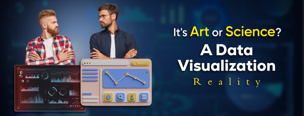
In a world flooded with data, how we interpret and communicate that data has never been more crucial. Data visualization has emerged as a vital bridge between raw information and actionable insights. But there’s an ongoing conversation among practitioners and enthusiasts: is data visualization more of an art or a science?
The answer isn’t straightforward—because data visualization is beautifully both.
What is Data Visualization?
At its core, data visualization is the graphical representation of information and data. Using elements like charts, graphs, maps, and infographics, it allows us to understand trends, patterns, and outliers in complex datasets.
Well-designed visualizations make data accessible. They allow businesses to make strategic decisions, researchers to share findings, and the general public to grasp information quickly and intuitively.
The Scientific Side: Data Visualization as Science
Those who see data visualization as a science focus on precision, structure, and integrity. In this camp, visualization is about:
- Accuracy: Representing data truthfully without distortion.
- Statistical Validity: Ensuring visualizations reflect correct mathematical relationships.
- Cognitive Load Reduction: Using design to aid, not hinder, comprehension.
- Standardization: Leveraging best practices, such as Edward Tufte’s principles or the use of proven chart types like bar graphs and scatter plots.
In this approach, visualization is about function. The scientist values clean lines, logical hierarchies, and clarity. A line chart that helps a policymaker spot a declining trend in public health data is a successful outcome—no need for bells and whistles.
The Artistic Side: Data Visualization as Art
Then there are those who view data visualization as an art form—an opportunity to communicate information in an evocative and emotional way. For these creators, the visualization isn’t just about clarity but about:
- Creativity: Breaking free from rigid templates to design unique visual experiences.
- Emotion: Making the audience feel something about the data, not just understand it.
- Storytelling: Weaving narratives that guide viewers through the data.
- Aesthetics: Using color theory, composition, typography, and style to create beauty.
Artists might design visualizations that resemble abstract paintings or interactive experiences that invite exploration. These visuals often push the boundaries of what charts can do, combining artistic intuition with data integrity.
Where Art and Science Meet
The most effective data visualizations often live at the intersection of art and science. They:
- Balance beauty with function
- Tell a story without distorting truth
- Evoke curiosity while remaining grounded in facts
For instance, Florence Nightingale’s 19th-century rose diagram wasn’t just a statistical tool; it was a persuasive visual statement that changed public health policy. Similarly, modern visual storytellers like Giorgia Lupi combine data, illustration, and emotion to create deeply human experiences.
Why Data Visualization Matters Today
In the age of big data, the ability to extract meaning from complexity is power. Data visualization allows us to:
- Detect patterns hidden in thousands of rows
- Make decisions faster with clear dashboards
- Communicate results across teams and stakeholders
- Educate and inform the public in impactful ways
Whether you’re a business analyst, journalist, policymaker, or designer, understanding how to visualize data is an essential skill.
Tools of the Trade
Today, numerous tools cater to both the artistic and scientific mind:
- Scientific/Structured Tools: Tableau, Power BI, Excel, R, Python (Matplotlib, Seaborn)
- Artistic/Customizable Tools: D3.js, Processing, Adobe Illustrator (for static visuals), and even Figma
These tools offer different levels of flexibility, interactivity, and creative control.
Conclusion: The Harmony of Art and Science
To see data visualization solely as a science is to risk losing its emotional impact. To view it only as an art form is to risk clarity and truth. But when you treat it as both—a discipline that respects data while embracing creativity—you unlock its full potential.
Data visualization is an art grounded in science. And in the hands of a skilled practitioner, it becomes a powerful language—a way of speaking the truth with beauty.
Do you agree with me that art and science complement each other in data visualization? Or do you favor one option over the other? Share your opinion with us in the comments.
فن تصور البيانات: حيث يلتقي الإبداع بالوضوح
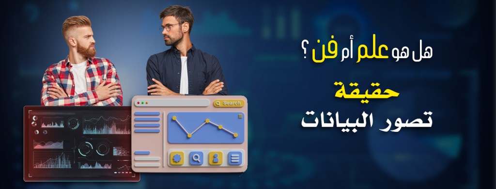
في عالمٍ غارقٍ بالبيانات لم تكن كيفية تفسيرنا لتلك البيانات وتوصيلها أكثر أهميةً من أي وقتٍ مضى، وقد برز تصور البيانات كجسرٍ حيويٍّ بين المعلومات الخام والرؤى العملية ولكن هناك نقاشٌ مستمرٌّ بين الممارسين والمتحمسين: هل تصور البيانات فنٌّ أم علمٌ؟
الإجابة ليست واضحةً لأن تصور البيانات يجمع بينهما بشكلٍ رائع
ما هو تصور البيانات؟
في جوهره تصور البيانات هو التمثيل البياني للمعلومات والبيانات وباستخدام عناصر مثل المخططات البيانية والخرائط والرسوم البيانية يُتيح لنا فهم الاتجاهات والأنماط والقيم الشاذة في مجموعات البيانات المعقدة
التصورات المُصمَّمة جيداً تجعل البيانات في متناول الجميع، فهي تُتيح للشركات اتخاذ قراراتٍ استراتيجية وللباحثين مشاركة النتائج وللجمهور العام فهم المعلومات بسرعةٍ وبديهة
الجانب العلمي: تصور البيانات كعلم
يُركِّز أولئك الذين يعتبرون تصور البيانات علماً على الدقة والهيكلية والنزاهة، وفي هذا السياق يتمحور التصور حول
• الدقة: تمثيل البيانات بصدق ودون تحريف
• الصلاحية الإحصائية: ضمان أن تعكس التصورات العلاقات الرياضية الصحيحة
• تخفيف العبء المعرفي: استخدام التصميم لتعزيز الفهم لا لإعاقته
• التوحيد القياسي: الاستفادة من أفضل الممارسات مثل مبادئ إدوارد توفته أو استخدام أنواع الرسوم البيانية المجربة مثل الرسوم البيانية الشريطية ومخططات التشتت
في هذا النهج يتمحور التصور حول الوظيفة، إذ يُقدّر العالم الخطوط الواضحة والتسلسلات الهرمية المنطقية والوضوح، ويُعدّ الرسم البياني الخطي الذي يساعد صانع السياسات على رصد اتجاه انحداري في بيانات الصحة العامة نتيجة ناجحة – دون الحاجة إلى أي إضافات أو إضافات
الجانب الفني: تصور البيانات كفن
ثم هناك من ينظرون إلى تصور البيانات كشكل فني أي فرصة لتوصيل المعلومات بطريقة مثيرة للعواطف، فبالنسبة لهؤلاء المبدعين لا يقتصر التصور على الوضوح فحسب بل يشمل أيضاً
• الإبداع: التحرر من القوالب الجامدة لتصميم تجارب بصرية فريدة
• التأثير العاطفي: جعل الجمهور يشعر بشيء ما تجاه البيانات وليس مجرد فهمها
• سرد القصص: نسج سرديات تُرشد المشاهدين عبر البيانات
• الجماليات: استخدام نظرية الألوان والتركيب والطباعة والأسلوب لخلق الجمال
• قد يصمم الفنانون تصورات تُشبه اللوحات التجريدية أو التجارب التفاعلية التي تدعو إلى الاستكشاف، فغالباً ما تتجاوز هذه المرئيات حدود ما يمكن أن تقدمه المخططات البيانية جامعةً بين الحدس الفني وسلامة البيانات
حيث يلتقي الفن والعلم
:غالباً ما تكمن أكثر تصورات البيانات فعالية في تقاطع الفن والعلم، فهي
• توازن بين الجمال والوظيفة
• تروي قصة دون تشويه الحقيقة
• تثير الفضول مع الحفاظ على الأسس المنطقية
على سبيل المثال لم يكن مخطط الوردة الذي صممته فلورنس نايتنجيل في القرن التاسع عشر مجرد أداة إحصائية، بل كان بياناً بصرياً مقنعاً غيّر سياسة الصحة العامة ، وبالمثل يجمع رواة القصص البصرية المعاصرون مثل جورجيا لوبي بين البيانات والرسوم التوضيحية والعاطفة لخلق تجارب إنسانية عميقة
لماذا يُعدّ تصور البيانات مهماً اليوم؟
في عصر البيانات الضخمة تُعدّ القدرة على استخلاص المعنى من التعقيد قوةً حقيقية يُتيح لنا تصور البيانات ما يلي:
• اكتشاف الأنماط المخفية في آلاف الصفوف
• اتخاذ القرارات بشكل أسرع باستخدام لوحات معلومات واضحة
• إيصال النتائج إلى الفرق وأصحاب المصلحة
• تثقيف الجمهور وإعلامه بطرق مؤثرة سواء كنت محلل أعمال أو صحفياً أو صانع سياسات أو مصمماً فإن فهم كيفية تصور البيانات مهارة أساسية
أدوات العمل
:تلبي العديد من الأدوات اليوم احتياجات كل من العقل الفني والعلمي
: أدوات علمية/مهيكلة *
Tableau، Power BI، Excel، R، Python (Matplotlib، Seaborn)
:أدوات فنية/قابلة للتخصيص *
(للصور الثابتة) Adobe Illustrator , Processing ,D3.js
الخلاصة: انسجام الفن والعلم
إن النظر إلى تصوير البيانات كعلمٍ فقط يُخاطر بفقدان تأثيره العاطفي، وإن النظر إليه كشكلٍ فنيٍّ فقط يُخاطر بالوضوح والحقيقة، ولكن عندما تتعامل معه على أنهما معاً – أي تخصصٍ يحترم البيانات ويحتضن الإبداع – فإنك تُطلق العنان لكامل إمكاناته
تصوير البيانات فنٌّ قائمٌ على العلم، وعلى يد مُمارسٍ ماهر، يُصبح لغةً قويةً – وسيلةً للتعبير عن الحقيقة بجمال
هل تتفق معي بحقيقة التكامل بين الفن والعلم في تصور البيانات ؟ أم أنك ترجح إحدى الكفتين على الأخرى شاركنا رأيك في التعليقات
