


Today we will learn to create attractive and valuable bar charts with a simple set of code backed by some experience and technical skill.
There is no doubt that mastering the design of graphic visualizations is an important factor for any data scientist, so in this article we will learn about the most important procedures necessary to complete these designs using Python (Matplotlib & Seaborn).
Dataset:
In our research today, we will discuss a data set that includes information about Pokemons due to the diversity of its characteristics.
They are characterized by continuity (Pokemons are characterized by defense, attack and other combat skills).
It is characterized by a variety of groups (species, name and genes).
And logical (legendary) and thus we have a balance of a variety of models to create charts.
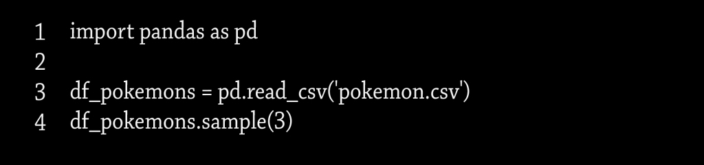
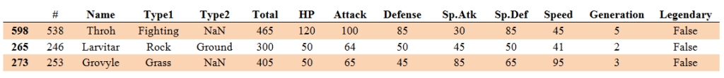
And to get this set of data immediately from the store by the main code related to our search as shown in this table:
Knowing the purpose of the analysis process is the initial stage for designing strong graphic representations by finding solutions to the questions raised about the data available to us.
Our data set can represent answers to many of the questions posed, and what the creation of an excellent chart depends on is finding a solution to the question asked about categorical values such as determining the type of Pokemon:
In our example presented in this research, the most appropriate question to be answered is:
What types of Pokemons have the highest attack values?
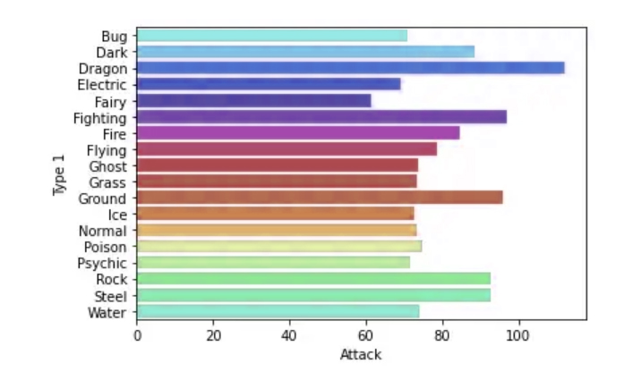
To prepare for the answer to this question we will start by preparing the data and creating the first “master” bar chart using Group by and we can plot the data using Seaborn
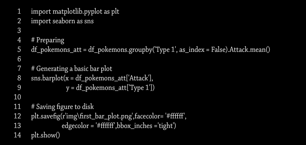

Observing what resulted in the scheme, it becomes clear to us that the information calls into question the validity of the answer to the question posed above, as it does not show us an accurate answer about the type of the highest attacking Pokemon.
In order to reach an accurate answer, we must adjust the data according to an ascending or descending pattern and determine the number of available items. When we reach the top ten positions, for example, we can exclude random data and make the chart more organized and useful.
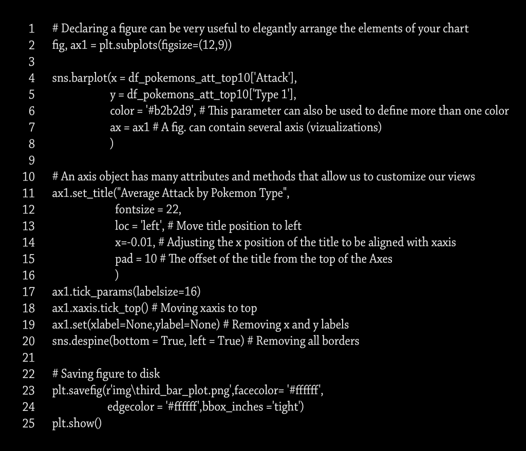
With more coordination and organization, we should not neglect the aspect of choosing the most appropriate colors, and this is embodied in selecting only one color. The value of the chart is derived from the appropriateness of the colors, and choosing different colors loses this value. This is done through a few code formats that enable us to add a title, change the font size, and adjust the image size.
We can make use of the color selection feature using Hex code.
Here is an explanation of how to write the code:
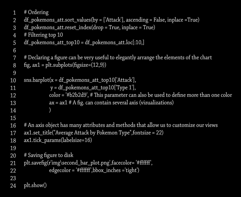
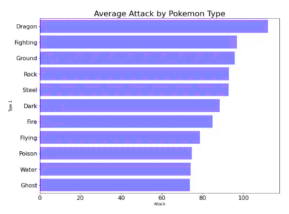
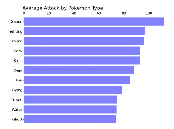
We notice that we are beginning to see a more organized result, and here we are about to achieve a more accurate answer by identifying the type of pokemon that is the best attacker, and what increases the graphic representation is more quality, the reset dimensions, in addition to the appropriate title that attracts the attention of the reader.
Despite the quality that we have achieved, it is possible to show a more organized and accurate scheme. This is done by removing redundant information that is useless. In our scheme, we note for each axis a name that indicates it, and it is also shown in the title. So here, repetition is useless.
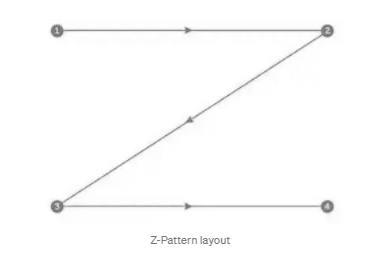
The direction of the graph also has implications that help the reader to identify the chart before reading the data itself. The prevailing definition is that reading the visualizations from left to right or from top to bottom enables the viewer to know the information that will be read first, and this is called the Z pattern.

Applying this pattern to our chart, we will move the title to the left to be read first and shift the X axis to the top for the same reason.
We have the following codes:

Thus, we have obtained an ordered and understandable graphic representation, and it can be said that we have obtained the required goal by creating an ideal bar chart visualization.
أنشئ المخطط الشريطي الخاص بك للوصول إلى مستوى متقدم بواسطة بايثون

سنتعلم اليوم إنشاء مخططات شريطية جذابة وقيِّمة وبمجموعة بسيطة من التعليمات البرمجية مدعومة ببعض الخبرة والمهارة الفنية
مما لا شك فيه أن إتقان تصميم المخططات البيانية هو عامل مهم لدى أي عالِم بيانات لذا سنتعرف في هذا المقال على أهم الإجراءات اللازمة لإنجاز هذه التصاميم على أكمل وجه
(Matplotlib & Seaborn) باستخدام بايثون
: مجموعة البيانات
في بحثنا اليوم سنتناول مجموعة بيانات تضم معلومات عن البوكيمونات نظراً لتنوع خصائصها
فهي تتصف بالاستمرارية ( فالبوكيمونات تتصف بالدفاع والهجوم وغيرها من المهارات القتالية )
وتتصف بزمر متنوعة ( الأنواع والاسم والجينات )
والمنطقية ( الأسطورية ) وبهذا يصبح لدينا رصيد من نماذج متنوعة لإنشاء المخططات البيانية
وللحصول على مجموعة البيانات هذه بشكل فوري من المخزن بواسطة الكود الرئيسي المتعلق ببحثنا هذا كما هو موضح في هذا الجدول


معرفة الهدف من عملية التحليل هو المرحلة الأولية لتصميم تمثيلات بيانية قوية وذلك عن طريق إيجاد الحلول للأسئلة المطروحة حول البيانات المتاحة لدينا
مجموعة البيانات الموجودة لدينا يمكن أن تمثل إجابات للعديد من الأسئلة المطروحة , وما يعتمد عليه إنشاء مخطط بياني ممتاز هو إيجاد حل للتساؤل المطروح عن قيم فئوية كتحديد نوع البوكيمون
وفي مثالنا المطروح في هذا البحث السؤال الأنسب المراد الإجابة عليه هو
ما هي أصناف البوكيمونات التي تمتلك أعلى قيم من حيث الهجوم ؟ *
“وللتحضير للإجابة عن هذا السؤال سنبدأ بتجهيز البيانات وإنشاء المخطط الشريطي الأول ” الرئيسي
Group by باستخدام
Seaborn ويمكننا رسم البيانات باستخدام

بملاحظة ما نتج عنه المخطط يتضح لنا أن المعلومات وتدعو إلى الشك في صحة الإجابة على السؤال المطروح آنفاً إذ لا تظهر لنا إجابة دقيقة عن نوع البوكيمون الأعلى هجوماً
وللوصل إلى إجابة دقيقة لابد لنا من ضبط البيانات وفق نسق تصاعدي أو تنازلي وتحديد عدد الأصناف المتاحة وعند الوصول إلى تحديد المراكز العشر الأولى مثلاً يصبح بإمكاننا استبعاد البيانات العشوائية وجعل المخطط أكثر تنظيماً وفائدة
وبمزيد من التنسيق والتنظيم لا يجب أن نهمل جانب الاختيار الأنسب للألوان ويتجسد ذلك بتحديد لون واحد فقط فقيمة المخطط مستمدة من مناسبة الألوان واختيار الألوان المختلفة تفقده هذه القيمة وهذا يتم من خلال بضعة أنساق من التعليمات البرمجية تمكننا من إضافة عنوان وتغيير حجم الخط وتعديل قياس الصورة يمكننا الاستفادة من خاصية اختيار الألوان
Hex باستخدام كود
: وفيما يلي توضيح لطريقة كتابة الكود


نلاحظ أننا بدأنا نلمس نتيجة أكثر تنظيماً وها نحن على وشك تحقيق إجابة أكثر دقة بتحديد نوع البوكيمون الأفضل هجوماً , ومما زاد التمثيل البياني أكثر جودة إعادة ضبط الأبعاد إضافة إلى العنوان المناسب الذي يلفت انتباه القارئ
ورغم الجودة التي وصلنا إليها إلا أنه بالإمكان إظهار مخطط أكثر تنظيماً ودقة ويتم ذلك عن طريق إزالة المعلومات المكررة التي لا فائدة منها وفي مخططنا نلاحظ لكل محور اسم يدل عليه وهي موضحة أيضاً في العنوان إذاً هنا التكرار لا فائدة منه كما وأن لاتجاه الرسم البياني مدلولات تعين القارئ على التعرف على المخطط قبل قراءة البيانات نفسها فالتعريف السائد أن قراءة التصورات من اليسار إلى اليمين أو من الأعلى إلى الأسفل يمكن الناظر من معرفة المعلومات التي سيتم قراءتها أولاً
Z وهذا ما يسمى بالنمط
وبتطبيق هذا النمط على مخططنا سنقوم بنقل العنوان إلى اليسار لتتم قراءته أولاً
X وإزاحة المحور
: إلى الأعلى للسبب ذاته فينتح لدينا الرموز التالية

وبهذا نكون قد حصلنا على تمثيل بياني مرتب ومفهوم ويمكن القول أننا حصلنا على الغاية المطلوبة بإنشاء تمثيل بياني شريطي مثالي
