
In this article, we will highlight some of the best graphic visualizations for the year 2022 related to specific events that took place during this year.
1. Most popular websites since 1993:
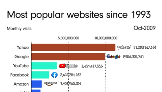
In this scenario, we see a comparison between the most popular sites since 1993. It is remarkable that Yahoo still maintains advanced positions in the ranking of the most popular sites until the beginning of 2022.
2. The time period for a hacker to set your password for 2022:

It is noticeable in many Internet sites to adopt the principle of assigning a group of various characters and less than numbers, the above visualization shows the period of time consumed by those who try to infiltrate other sites and accounts in hacking your passwords in the current year.
The importance of this type of visualization lies in the fact that its system relies mainly on the distribution of colors indicating the different times spent trying to decipher the password.
3. High prices of basic materials:

It is worth noting that the rise in the general level of prices and the continuous and increasing demand for materials is one of the results of the war between Russia and Ukraine. In the above scenario, we notice the impact of inflation on the prices of basic materials consumed on a daily basis, such as fuel, coffee and wheat.
The concept of this type of graph can be simplified as a measurement of the rates of rise and fall in the level of a group of bar shapes with the change of time in varying proportions.
4- The most famous fast food chains in the world:

In the above visualization, we see the 50 most popular fast food chains, according to the amount of restaurants in America. This classification was based on the size and category of the restaurant.
Through visualization, we see that McDonald’s is more popular than other restaurant chains around the world
This type of visualization is called an organization chart, and it is intended to distinguish hierarchical data according to a specific classification
5. NATO versus Russia:

One of the most prominent events of this year is the Russian war on Ukraine. Through the graph representing the balance of power between Russia and NATO, you can get acquainted with the real information related to this issue.
This diagram consists of an image made up of a number of illustrations that reach the viewer with the idea presented in the visualization in an attractive and understandable way.
6. The quality of students in educational facilities:
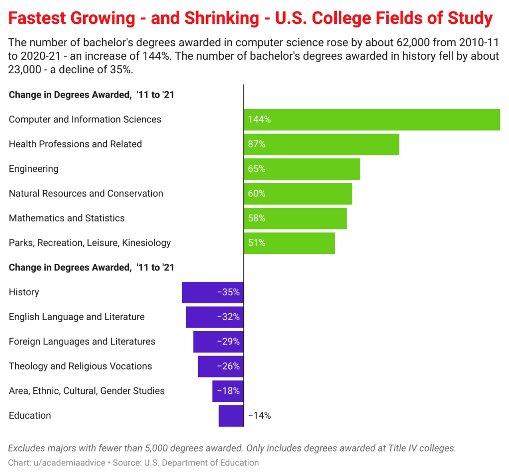
The above visualization shows a comparison between the most and least prevalent types of studies in American colleges. Through what the graphic representation shows, we find that the demand for sciences related to technology, engineering and mathematics increases rapidly compared to the low level of demand for sciences related to arts and history.
7. Most used web browsers over the last 28 years:

The visualization included above shows the most used web browsers over the past 28 years, and the visualization also shows that the Google Chrome browser has the largest proportions of use relative to the rest of the browsers.
This visualization is based on divisions within a circular chart that increases and decreases with the change of time, similar to the strip visualization, but it is distinguished from the strip visualization in distinguishing ratios more accurately, away from absolute numbers.
8. The most spoken languages in the world :
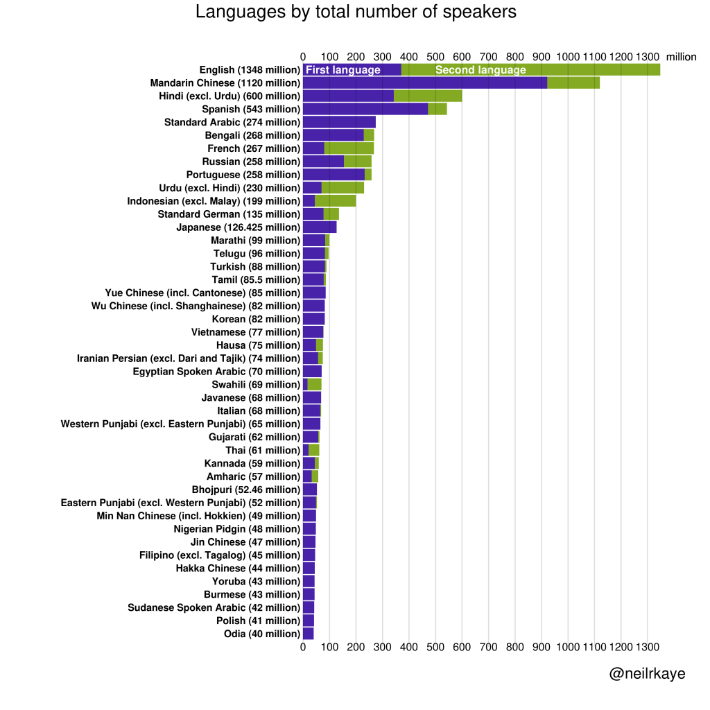
This visualization is characterized by its simplicity, but it is of great value. It is of the bar type that identifies the most used languages in the world.
As shown in the chart, English ranks first in the world, followed by Mandarin and then Hindi.
9. School accidents:

This scenario dealt with statistical rates of some school shooting incidents in many countries during certain periods. The chart shows that the United States recorded the highest percentage of this type of incident compared to the rest of the countries.
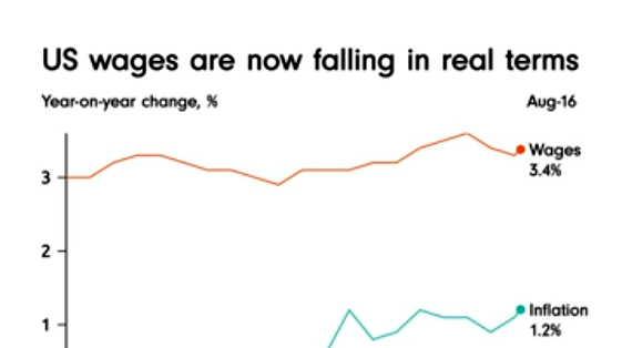
10. A further rise in prices and wages:

In addition to the inflation that affects the daily consumed basic materials, wages also have a share of this negative impact. It is well known that with the high level of inflation, the value of the US dollar decreases compared to previous periods.
This perception represents a schematic image that shows the variation in wage growth compared to inflation from several years ago to the present time.
According to the above, we presented models for the best dozens of graphic visualizations of the most important events of the year 2022, which constitute useful models in different forms of graphic planning, depending on classification, sorting, and statistics. You can benefit from them if you decide to perform any type of visualization.
أفضل 10 تصورات بيانية لعام 2022
سنقوم بهذا المقال بتسلط الضوء على بعض أفضل التصورات البيانية للعام 2022 المرتبطة بأحداث معينة جرت خلال هذا العام
1. مواقع الويب الأكثر شيوعاً منذ عام 1993

في هذا التصور نشاهد مقارنة بين المواقع الأكثر شهرةً منذ عام 1993 ومن اللافت أن موقع ياهو ما زال محتفظاً بمراكز متقدمة سلم ترتيب تصنيف المواقع الأكثر شهرة حتى بداية عام 2022
2. الفترة الزمنية التي يستهلكها المتسلل لتعيين كلمة المرور الخاصة بك لعام 2022
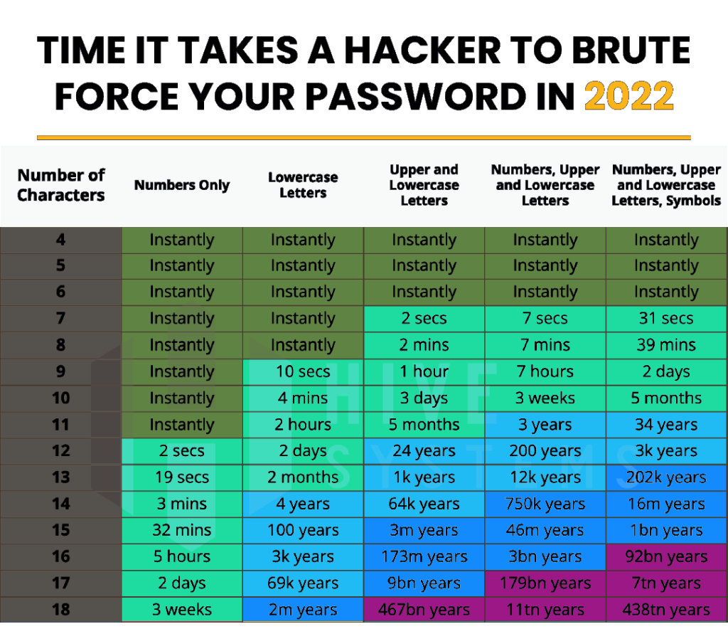
من الملاحظ في العديد من مواقع الإنترنت اعتماد مبدأ تعيين مجموعة من الأحرف المتنوعة ومنازل أقل من الأعداد , يبين التصور أعلاه الفترة الزمنية التي يستهلكها من يحاول التسلل إلى المواقع وحسابات الآخرين في اختراق كلمات المرور الخاصة بك في العام الحالي
تبرز أهمية هذا النوع من التصور في كون نظامه يعتمد بشكل أساسي على توزيع الألوان الدالة على اختلاف الأوقات المستهلكة في محاولة فك شيفرة كلمة المرور
3. ارتفاع أسعار المواد الأساسية
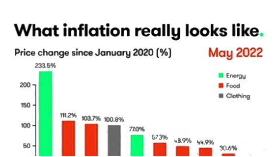
الجدير بالذكر أن ارتفاع المستوى العام للأسعار والطلب المستمر والمتزايد على المواد هو أحد نتائج الحرب بين روسيا وأوكرانيا وفي التصور الموضح أعلاه نلاحظ أثر التضخم على أسعار المواد الأساسية المستهلكة بشكل يومي كالمحروقات والبن والقمح
يمكن تبسيط مفهوم هذا النوع من المخططات البيانية بأنه عبارة عن قياس لمعدلات ارتفاع وانخفاض في مستوى مجموعة من أشكال شريطية مع تغير الزمن بنسب متفاوتة
4. سلاسل مطاعم الوجبات السريعة الأشهر في العالم
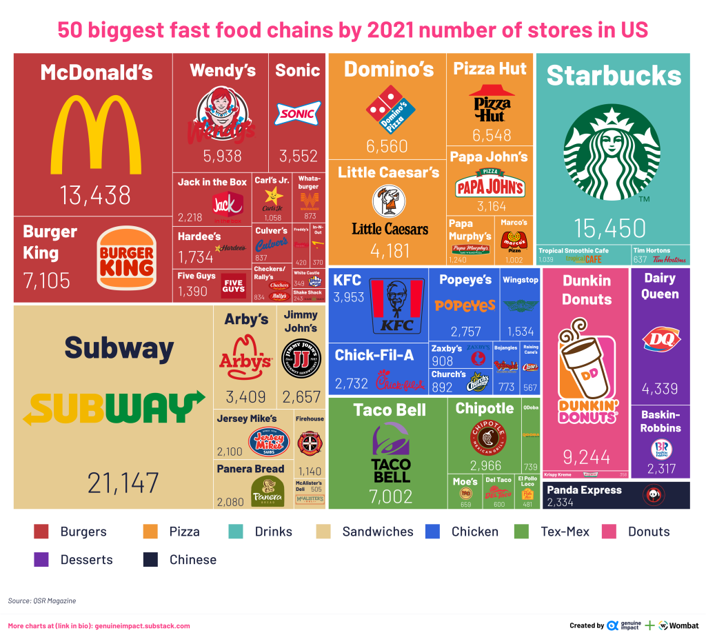
في التصور المدرج أعلاه نرى أشهر 50 سلسلة مطاعم للوجبات السرعة حسب كمية المطاعم الموجودة في أمريكا وقد اعتمد هذا التصنيف على حجم المطعم وفئته
من خلال التصور نرى أن ماكدونالدز تحظى بالشهرة الأوسع مقارنة مع باقي سلاسل المطاعم المنتشرة حول العالم
هذا النوع من التصورات يسمى مخطط هيكلي الغرض منه تمييز بيانات هرمية وفق تصنيف معين
5. الناتو مقابل روسيا
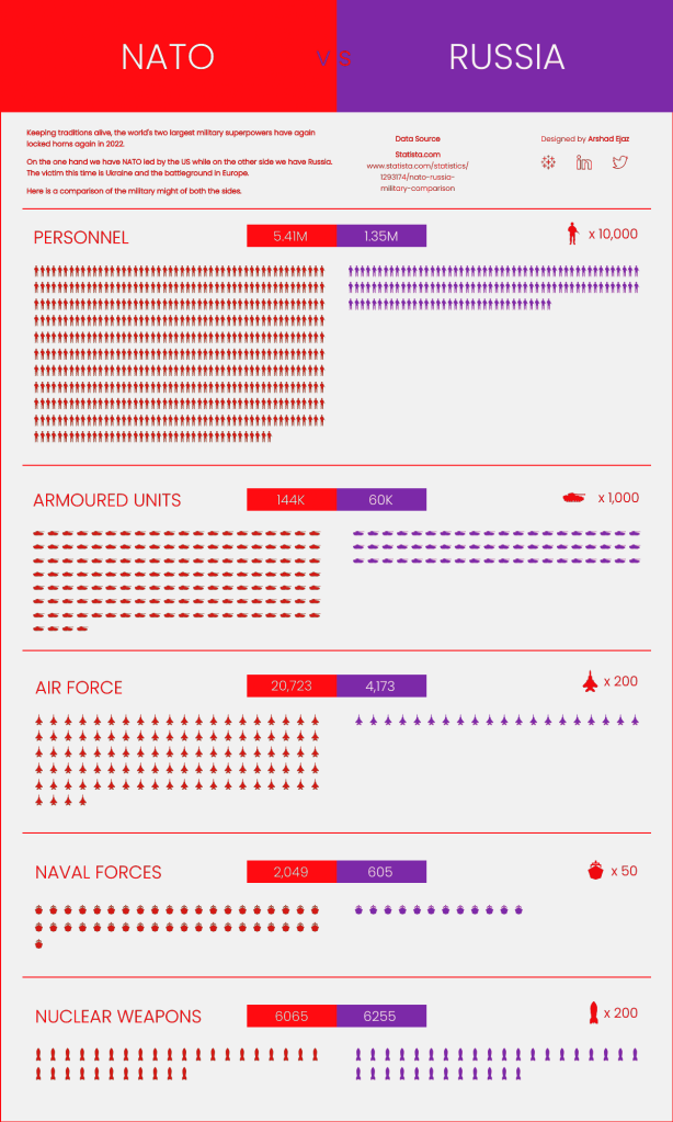
أحد أبرز أحداث هذا العام الحرب الروسية على أوكرانيا , من خلال الرسم البياني الممثل لميزان القوى بين روسيا والناتو تستطيع التعرف على المعلومات الحقيقة المتعلقة بهذا الموضوع
يتألف هذا الرسم البياني من صورة مكونة من تجميع عدد من الرسوم التوضيحية توصل إلى الناظر الفكرة المطروحة في التصور بشكل جذاب ومفهوم
6. نوعية الدارسين في المنشآت التعليمية

التصور المدرج أعلاه يبين مقارنة بين أنواع الدراسات الأكثر والأقل انتشاراً في الكليات الأمريكية ومن خلال ما يوضحه التمثيل البياني نجد أن العلوم المتعلقة بالتكنولوجيا والهندسة والرياضيات يزيد الإقبال عليها بشكل متسارع مقارنة بانخفاض مستوى الإقبال على العلوم المتعلقة بالفنون والتاريخ
7. متصفحات الويب الأكثر استخداماً عبر الـ 28 عاماً الأخيرة
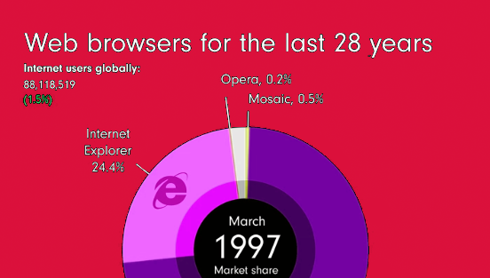
التصور المدرج أعلاه يوضح أكثر متصفحات الويب الأكثر استخداماً عبر الـ 28 عاماً الفائتة وكما يُظهِر التصور
يستحوذ على النسب الأكبر Google Crome أن متصفح
في الاستخدام نسبة إلى باقي المتصفحات
يعتمد هذا التصور على تقسيمات ضمن مخطط دائري تتزايد وتتناقص مع تغير الزمن على غرار التصور الشريطي ولكنه يتميز عن الشريطي في تمييز النسب بدقة أكثر بعيداً عن الأرقام المطلقة
8. أكثر اللغات استخداماً في العالم

يمتاز هذا التصور ببساطته ولكنه ذو قيمة كبيرة وهو من النوع الشريطي يحدد اللغات الأكثر استخداماً في العالم
كما هو موضح في المخطط تحتل اللغة الإنكليزية المرتبة الأولى في العالم تليها الماندرين ثم الهندية
9. حوادث المدارس
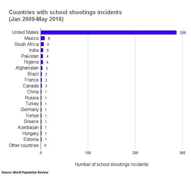
تناول هذا التصور نسب إحصائية لبعض حوادث إطلاق النار في المدارس في العديد من الدول خلال فترات معينة , يوضح المخطط أن الولايات المتحدة سجلت أعلى نسبة في وقوع هذا النوع من الحوادث مقارنة مع باقي البلدان
10. ارتفاع أكثر في الأسعار والأجور
علاوة على تأثر المواد الأساسية المستهلكة يومياً بالتضخم فإن للأجور نصيب أيضاً من هذا التأثر السلبي فمن من المعلوم أن مع ارتفاع مستوى التضخم تنخفض قيمة الدولار الأمريكي مقارنة بالفترات السابقة
يمثل هذا التصور صورة تخطيطية تبين تفاوت نمو الأجور بالمقارنة مع التضخم منذ عدة أعوام إلى وقتنا الراهن
وفق ما ذكر أعلاه قدمنا نماذج لأفضل عشرات تصورات بيانية لأهم أحداث العام 2022 تشكل نماذج مفيدة في أشكال مختلفة للتخطيط البياني اعتماداً على التصنيف والفرز والإحصائيات يمكنك الاستفادة منها في حال قررت إجراء أي نوع من أنواع التصور
