Data Visualization By Python

Advertisements

Here I will explain visualization by using python. The explanation will be on a real case but I will only introduce python codes with charts explanation.

What is the Dataset about?

We will work on the Breast Cancer Wisconsin (Diagnostic) Dataset. Here, Features are taken from the image of a fine needle aspirate (FNA) of a breast mass. They describe characteristics of the cell nuclei present in the image. You can find this dataset in Kaggle.

What are the Data Visualization steps on this Dataset?

1. Importing libraries

2. Distribution plot

3. Pair plot

4. Count plot for Categorical columns

5. Checking Outliers existence

6. Correlation matrix

Matplotlib & Seaborn are the two main libraries in Python as well as other libraries such as: GGplot and Plotly

So let’s start with the first step:

1. Importing the required libraries:

import matplotlib.pyplot as plt

import seaborn as sns

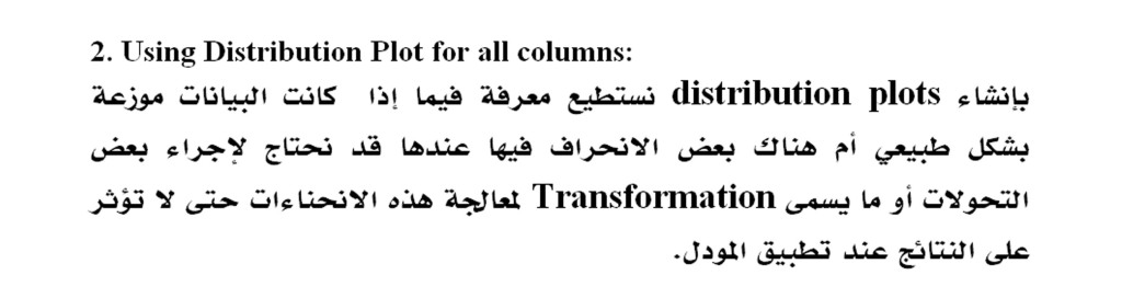
2. Using Distribution plot for all columns:

By creating distribution plots, we can know if the data is normally distributed or there is some skew in it, then we may need to make some transformations to get better results from the machine learning models.

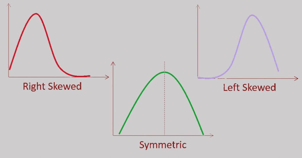
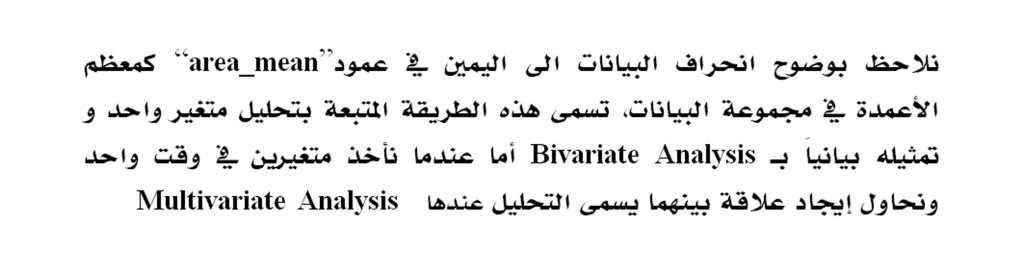
Here we will create the distribution plot for all columns in the dataset and I will display the distribution plot for the “area_mean” column

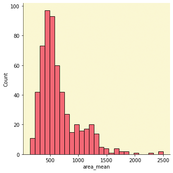
We clearly notice the right skewness for the “area_mean” column, like most of the columns in the data set. This method of analysis called Univariate Analysis, where we take one variable and analyze it, but when we take two variables at the same time and try to find a relationship between them, then it is called Multivariate Analysis.
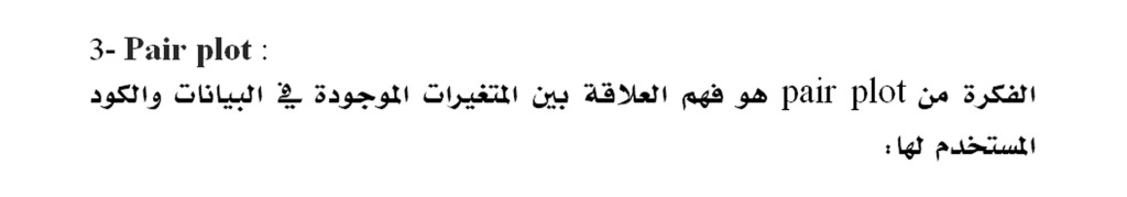
3-Pair plot:

The main concept of the pair plot is to understand the relationship between the variables.

Its code is:

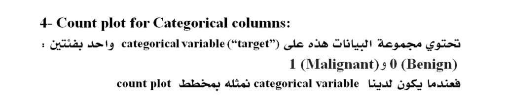
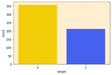
4- Count plot for Categorical columns:

When we have a categorical variable we will plot it in a count plot.

This dataset contains one categorical variable (“target”) with two classes:

0 (Benign) and 1 (Malignant)

Count plot can show the total counts for each cateu. As we can see, the number of data points with a rating of ‘0’ is higher than that of ‘1’ which means that we have more Benign cases than Malignant cases in this dataset which is an indication about unbalanced Data.
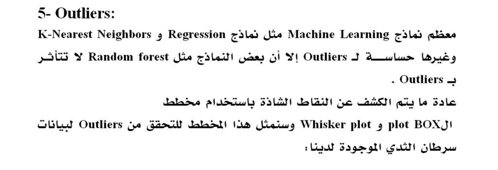
5- Outliers:

Most ML algorithms such as Regression models, K-Nearest Neighbors, etc are sensitive to Outliers, but other models such as Random forest are not affected by Outliers.

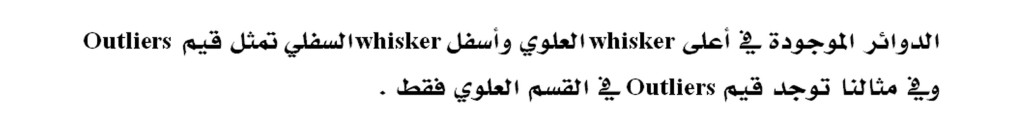
The plot that reveals the outliers is a BOX and Whisker plot:

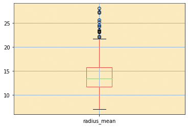
At the top of the plot in the loop we will create a box for all the columns in the data set which we will display to the “radius_mean” variable alone.

The circles at the top of the top whisker and below the bottom whisker represent the values of the Outliers

In our example, the Outliers values are in the top section only.

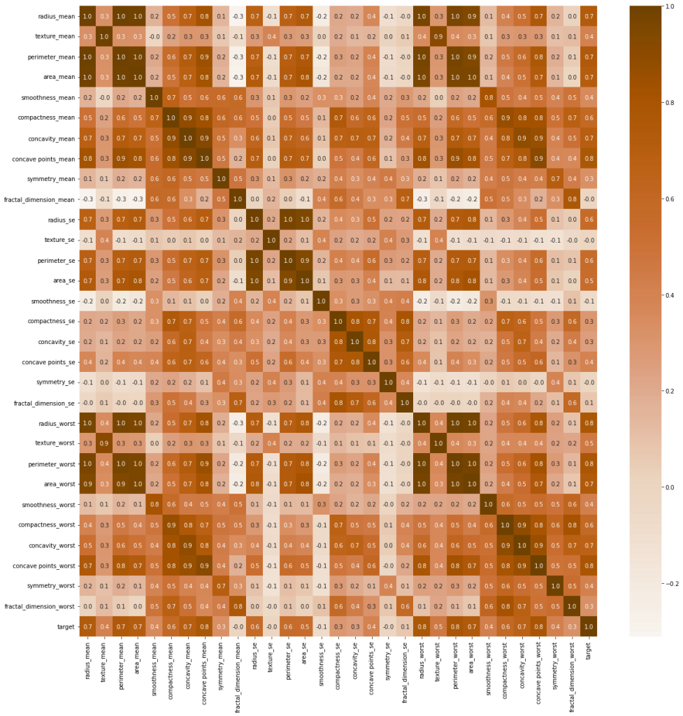
6- Correlation matrix:

Its purpose is to find out the correlation between the variables in the data set so that the useful features are selected and the unnecessary ones removed.

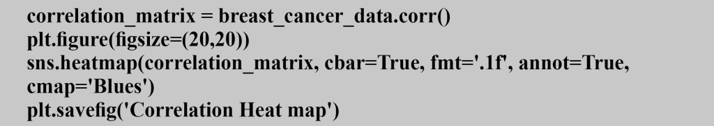
We will create a Heat Map to visualize the relationship between the variables :

correlation values range from +1 to -1
If the correlation between two variables is +1, the correlation is positive, and if the correlation is -1, it is negative
Determining the type of correlation between two variables helps in facing the problem of multiple linearity and assit us to take the decision in removing one of the features especially when we have two independent variables that are highly correlated.

Finally, These are the most popular plots that we can create for the dataset that we have. There are several other plots like Pie chart, Scatter plot, etc. We always decide the plots that we need to use depending on the dataset and the insights we are looking for as the conclusions that we derived from Data Visualization process will be helpful for models applications.

Advertisements
Advertisements
Advertisements

What Is Data Visualization?

Advertisements

This term refers to the visual figures and symbols that capture information in the form of GEOGRAPHICAL MAPS, CHARTS, SPARKLING, INFOGRAPHICS, HEAT MAPS, OR STATISTICAL GRAPHS.

These graphics represent several factors such as AI integration, information abundance, and interactive exploration to make information simple to understand and study that expands the possibility of obtaining more accurate and effective results.

In this context, we offer 5 tools of data visualization that are flexible and efficient:

1- Tableau

This tool provides a complete information architecture building, including Tera, SAP, My SQL, Amazon AWS, and Hadoop and helps in creating schematic diagrams for the foundations of information on an ongoing basis, which made it the most popular tool among data visualization users because it has several advantages, including:

• High efficiency of visualization

• Smooth handling

• Accuracy and effectiveness in performance

• The ability to connect to different data sources

• Responsive Mobile

• It has media support

However, this tool is not without some disadvantages, such as:

• Low pricing

• Lack of automatic update feature and scheduling of the report

2- Power BI

Flexible tool from Microsoft This tool supports a huge amount of back-end information including Teradata, Salesforce, PostgreSQL, Oracle, Google Analytics, Github, Adobe Analytics, Azure, SQL Server and Excel gives results with the great accuracy and speed.

This tool has the following advantages:

– No specialized technical support required

– Easy compatibility with popular applications

– Professional and diversified control panel

– Unlimited speed and memory

– High level security

– Compatibility with Microsoft applications

However, its disadvantage is that it does not provide an environment to work with many and varied data sets.

3- JupyteR

This tool is characterized as one of the best data visualization tools as it allows its users to create and share files that include multiple visualizations and codes. In addition, it is an ideal tool for:

Data cleansing, transformation, statistical modeling, numerical simulation, interactive computing and machine learning.

Positives :

– Prototyping speed

– Give results in elegant looking shapes

– Share visual results easily

Negatives :

– Difficulty to cooperate

– Reviewing scripts is sometimes difficult

4- Google Charts

This tool has the ability to innovate graphical and graphical representation, as well as its compatibility with the most popular operating systems circulating around the world.

Positives :

– Ease of handling.

– The possibility of merging data with complete flexibility.

– Show graphical results through elegant looking graphics.

– Full compatibility with Google applications.

Negatives :

– Requires accuracy in export procedures.

– Lack of demonstrations on tools.

– Unavailability of customization.

– Required network connection required for visualization.

5- IBM Watson

This tool is highly efficient, as it relies on analytical components and artificial intelligence to create models from regular and random information to reach the optimal visualization.

Positives :

– Neuro Linguistic Programming skills.

– Availability from several devices.

– Predictive studies.

– Self-service control panel.

Negatives :

– Need to develop customer support service.

– High maintenance costs.

At the End, Learning visualization is very important during the data science learning journey based on studies that indicate the rapid growth and development in the use of the Internet and information technology.

Advertisements
Advertisements
Advertisements

7 Features That Make Python The Most Suitable Choice For Starting Your Project

Advertisements

1- Flexibility At Work :

The Pythons environment is smooth and flexible through its support for several types of other programming languages, so dealing with it allows for change and modification as required by the work plan

2- Most Popular :

The most famous platform used around the world because of the codes simplicity that  makes this language the most widely spread language

3- Ease Of Learning And Use :

Compared to other programming languages, Python is the easiest language to learn, which allows developers to easily deal with it in developing their programs and projects

4- Diversity Of tasks And Versatility Of Uses :

It can be used in many fields related to data and software and in developing applications as it supports all operating systems and it is compatible with databases used around the world

5- Open Source :

Python can be used to implement any project and modify it according to the requirements of that project as it is open source and development is available to anyone

6- Supportive Community :

Python is a programmatic language that has a strong community that provides great support to its users. Any one can have assistance while developing using Python language as solutions to programming difficulties become available and fast

7-The Optimal Environment For Artificial Intelligence And Machine Learning :

The Python environment is open to creativity and discovery in everything related to data from artificial intelligence to machine learning, as it includes a large variety of libraries that allow its user to have a comprehensive view of the implementation of his work with high efficiency

Advertisements
Advertisements
Advertisements

5 Predictive Models Every Beginner Data Scientist Should Master

Advertisements

We offer you the  5 basic models you should know to start your learning journey Data Science.

Linear Regression

You will have high efficiency and skill to deal with regression by understanding the mathematics behind it. Linear regression allows predicting phenomenas by establishing linear relationships among the data.

Also, you can understand the algorithms from the linear regression representation in a simple 2-D diagram based on some sources such as:

  • DataCamp’s Linear Regression Explanation
  • Sklearn’s Regression Implementation
  • R For Data Science Udemy Course Linear Regression Section

Logistic Regression

It is the best model that you can rely on to obtain full efficiency in classification. Studying it gives you the ability to discover the controls of linear algorithms and to take note of the problems of classifications and their multiplicity.

You can check out some resources:

  • DataCamp’s Logistic Regression in R explanation
  • Sklearn’s Logistic Regression Implementation
  • R For Data Science Udemy Course — Classification Problems Section

Decision Trees

It is a simple model that prepares you for a comprehensive understanding of non-linear algorithms as it is the first algorithm that you should learn. It is the entry key to study different techniques that lead to optimal handling of Regression and classifications to get the best results.

Sources :

  • LucidChart Decision Tree Explanation
  • Sklearn’s Decision Tree Explanation
  • My blog post about Classification Decision Trees
  • R For Data Science Udemy Course —Tree Based Models Section

Random Forest

This type of algorithm is based on the idea of ​​a multiplicity of decision trees which gives your algorithm accuracy by averaging the results of previous models.

To learn more about the concept of Random Forest, here are some resources:

  • Tony Yiu’s Medium post about Random Forests
  • Sklearn’s Random Forest Classifier implementation
  • R For Data Science Udemy Course — Tree Based Models Section

Artificial Neural Networks

Here you will discover the concepts of neural network layers, as it is one of the most accurate and most effective models in discovering non-linear patterns in data.

In addition, studying it leads you to different forms of models, such as:

Recurrent Neural Networks (Natural Language Processing).

 Convolutional Neural Networks (used in computer technologies).

Here are some sources for more information:

  • IBM “What are Neural Networks” article
  • Keras (Neural Network implementation and abstraction) documentation
  • Sanchit Tanwar’s article about Building your First Neural Network

By learning these models, you are on the right track of the Data Science learning journey, as you will have the experience that allows you to study higher levels of these algorithms. This basic learning helps you crystallising your information that is related to the mathematics on which these models are built smoothly and simply.

Advertisements
Advertisements
Advertisements